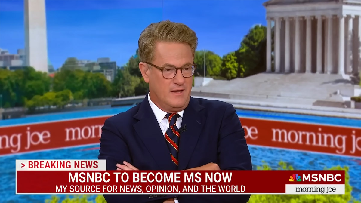
On Monday, the network soon-to-be formerly-known-as MSNBC announced its new name — My Source News Opinion World, or MS NOW — along with its new non-avian logo, and all of it pretty universally landed with a thud. I watched Rachel Maddow and Lawrence O’Donnell that night to see if either of them would address the rebrand, but they were too classy and stuck to the news. It’s a real achievement on the part of the marketing team, because MSNBC had an underdog/sympathetic edge going into this, due to the fact that NBC decreed to them (but not to CNBC) that they had to cease and desist using “NBC.” Even after they initially promised no one would have to change brand names! But no, instead it’s been a master class in how to underperform in retaliation, to the extent that I’m just imagining a Veep-style cast of characters making these decisions behind the scenes. There are some, however, rising to the occasion of this moment… in the form of excellent burns on the internet waxing on the main theme of this being “one of the worst branding disasters in media history.”
After the cable-news network announced it would become My Source News Opinion World, or MS NOW, later this year, netizens have taken to social media to make their disdain for the name and logo change more than abundantly clear.
The issue, according to the Internet, isn’t just the name, it’s also the look and “feel” of the new logo.
“MSNBC changing its name to MS NOW is one of the worst branding disasters in media history. The logo looks like it belongs on a discount computer from 1998, not a serious news network,” one user wrote. “Absurd.”
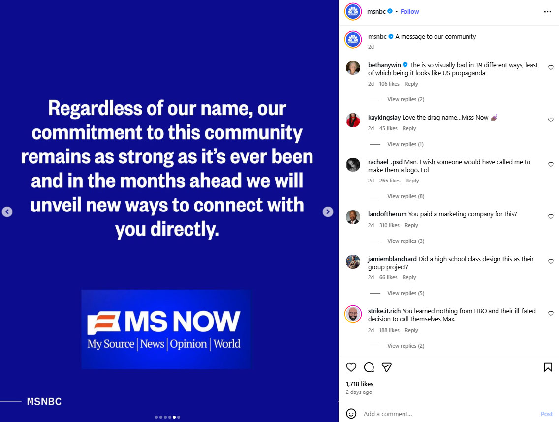
…The move conflicts with previous claims made by NBCUniversal that the network would be allowed to keep its name amid the shift. NBC’s iconic peacock logo will no longer be used for the cable-news network, either.
A memo sent Aug. 18 by MSNBC President Rebecca Kutler addressed the flip-flop, writing:
“During this time of transition, NBCUniversal decided that our brand requires a new, separate identity … The future of our success is not tied to remaining within the NBC family and using the peacock as part of our identity,” Rebecca Kutler, MSNBC President, wrote in an Aug. 18 memo addressed to staff.
The peacock-looking logo, according to MSNBC CEO Mark Lazarus, “is synonymous with NBCUniversal, and it is a symbol they have decided to keep within the NBCU family.”
Because of this decision, MSNBC is now free to “chart our own path forward, create distinct brand identities, and establish an independent news organization following the spin.”
MSNBC has certainly ruffled some feathers with the announcement, with netizens posting reactions (complete with GIFs), opinions and critiques about the rebrand, dubbed one of the “worst branding disasters in media history” on X, formerly known as Twitter, in the last 24 hours.
The rest of the USA Today article is a round-up of some of the best social media clapbacks, and they are all quite excellent. Like: “MSNBC to changing their name to MS NOW is like HBO changing their name to MAX and facebook changing to Meta and Twitter to X. I will never call it the new name,” followed by a GIF of Gandalf venting on Pippin Took: “Throw yourself in next time and rid us of your stupidity.” Or: “MS NOW sounds like a short-lived Windows operating system from the early 2000s that needlessly redesigned too much and failed to be adopted by a critical mass of users.” Plus: “*adjusting my tie and walking to her table to take my shot* Is there a MISTER NOW, MS NOW?” And: “After MS Now will be MS Go, and then MS Max, and then just MS.” There really is a wealth of creativity out there.
So in conclusion, the rebrand sucks on name, logo, and execution fronts. (Otherwise known as all fronts.) I said on Tuesday, and I know I’m not the only one, that the name reads like Multiple Sclerosis NOW. In regard to the logo, call me petty and/or vindictive, but I think they totally missed an opportunity to get back at NBC. How? By making their new logo another bird! Owls have symbolism related to knowledge, yes? Though coming out of November 2024, an ostrich may be more fitting.
After MS Now will be MS Go, and then MS Max, and then just MS.
— Scott Nover (@ScottNover) August 18, 2025
MS NOW sounds like a short-lived Windows operating system from the early 2000s that needlessly redesigned too much and failed to be adopted by a critical mass of users https://t.co/kSJO19bJxX
— Josh Billinson (@jbillinson) August 18, 2025
Photos via YouTube and Instagram